When I was fourteen years old my dad told me I should be an art director in the crazy world of advertising. I agreed with him and never looked back. He also told me that I'd spend my life in San Francisco and, so far, I’ve spent my entire career here. I’ve worked at a wide range of shops from global advertising agencies like Arnold, to multicultural agencies like Carol H. Williams, to pure branding and design firms like Noise 13.
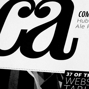
A number of years ago, I joined a little-known integrated advertising and design firm called Hub Strategy and Communication. I was hired as their design director and was quickly asked to become a partner. From there, I set my sights on putting Hub on the map. I started by building out an incredibly talented full-time creative team and then focused on greatly widening our global freelance network of art directors, designers and writers. Under my leadership we attracted clients like Nike, Sephora, Levi’s, Banana Republic, Google, Sony, Microsoft, Facebook and Twitter. These new high-profile clients plus our unique business model caught the eye of Communication Arts magazine and they asked to do a 10-page feature on us. We quickly started picking up international awards for our adverting and design work and a few years ago I was invited to be a CLIO judge. I’ve written articles for, or have been interviewed by, Adweek, AdAge, HOW and Print. Throughout this entire time, Hub also saw some of its most profitable years.
Post-Hub, I was the creative director at a brand strategy and design firm where I partnered closely with the founder to manage all aspects of the business. We did everything from packaging, to identity, to websites, to events. We even ran our own creative conference called InVisible Talks. Most recently, I've returned to advertising to help an old creative director friend build out the new business practice of his LA-based agency.
I believe that every part of a brand, no matter how small or seemingly insignificant, has the chance to make a meaningful connection with the consumer. This is why my portfolio has so much more in it than just a bunch of traditional advertising campaigns and it is why I wanted to spend part of my career working outside of an advertising agency. With the combination of my experiences, I've been able to build brands from the early stages of naming the company and creating their identity, all of the way through launching their product with a fully integrated advertising campaign. When you get to craft that many pieces of a brand you really start to feel a part of it and that's pretty damn great. You also get to see how much more successful a brand can be when all of the pieces are working so tightly together.
Regardless of where I’ve been, the position I've held, or the type of projects I’ve worked on, I’ve continually strived to make everyone around me better at what they do and happier doing it.
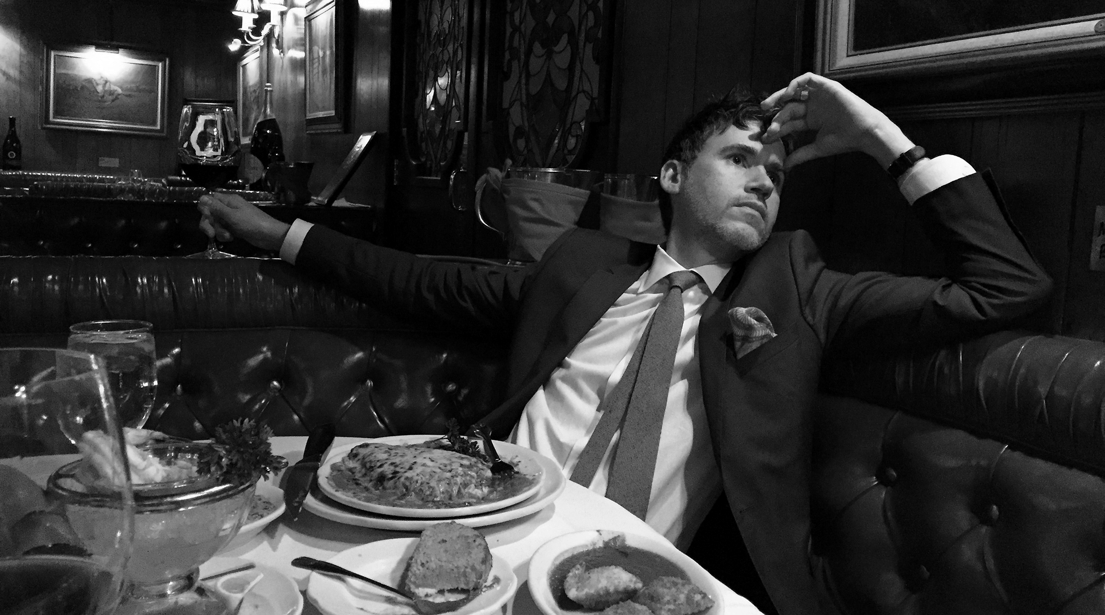
I’m always up for a yap about the business, Burt Reynolds, or my time in a techno band called Moses On Acid. So, feel free give me a shout and thanks for stopping by.