Tipping Point is probably the most respected organization the Bay Area fighting poverty and homelessness. Tipping Point knew that they could not deny the current state of the state. The beautiful streets of San Francisco are riddled with homeless encampments as even tiny studio apartments are out of reach for those earning a decent wage Tipping Point needed to admit the truth about how bad the situation is and, at the same time, effectively share the truth about how what they are doing is working and making a difference. Even though it might not look that way.
The overarching theme of the campaign we created for Tipping Point was “Make this Moment” and the story behind it was steeped in San Francisco’s history as a city that has always embraced critical moments and, through its actions, transformed that moment and history itself.
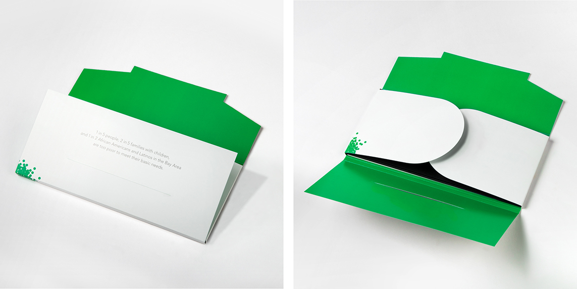
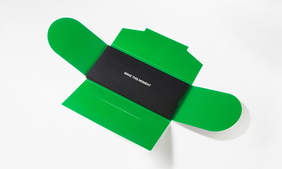
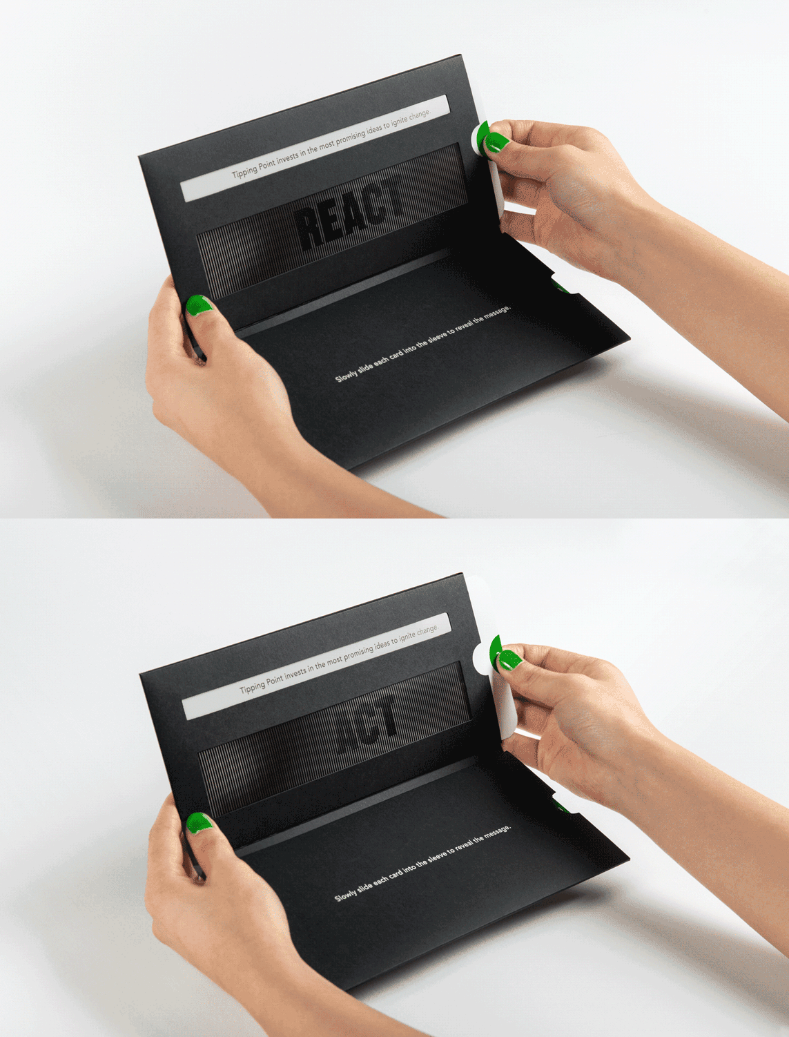
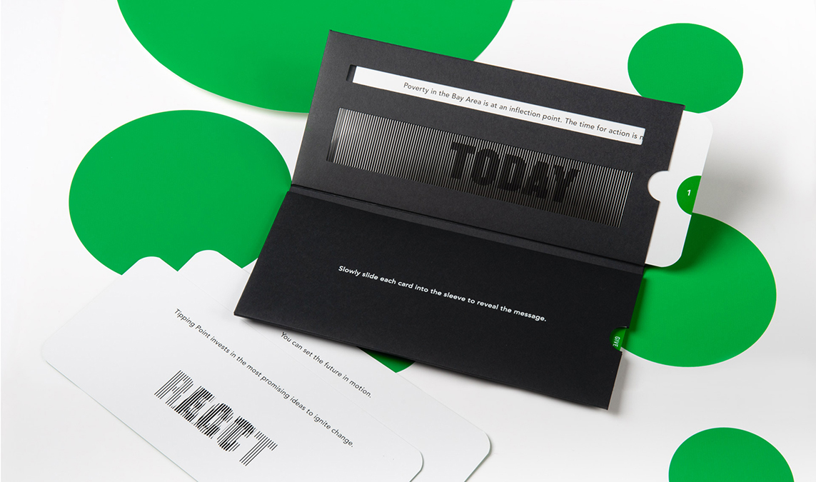
The first piece we designed was their annual appeals mailer. We wanted the mailer to be interactive and, as we thought about the idea of transformation, we started playing with lenticular animations. The final piece tells the story of Tipping Point’s mission through a series of lenticular cards contained within a custom envelope-like box. The design of this mailer carried over to presentation templates and email templates, including some animations.
Collateral

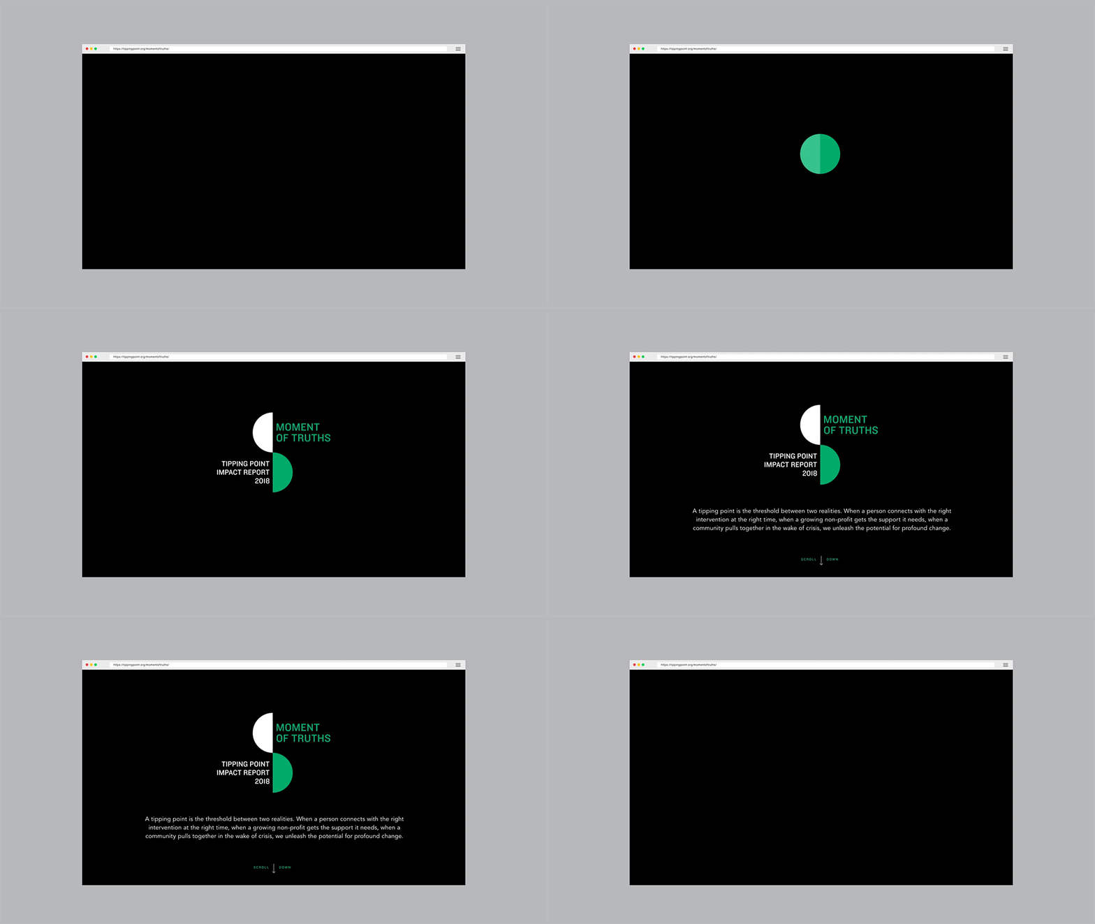
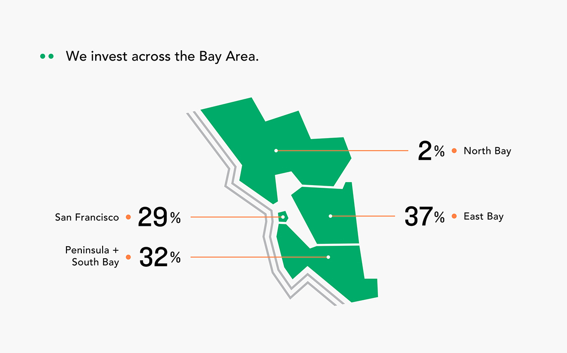
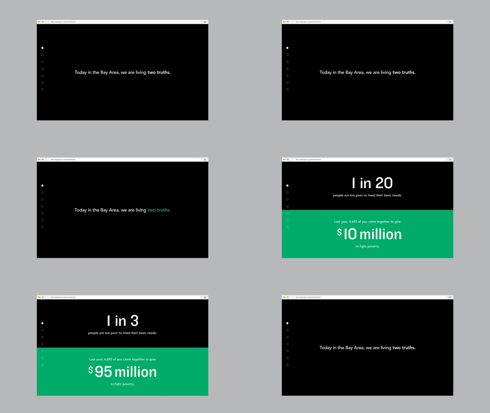
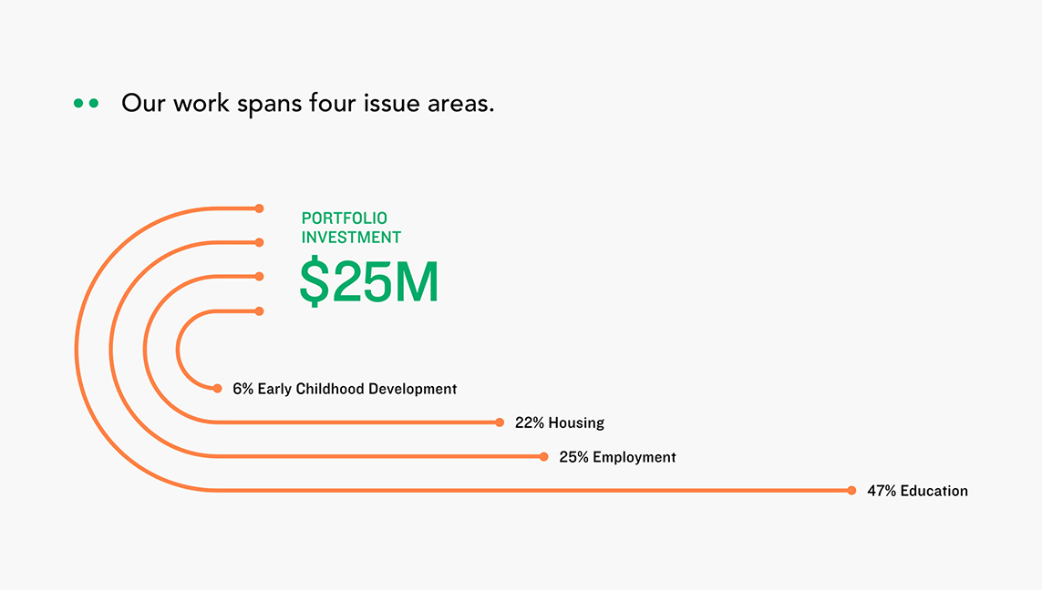
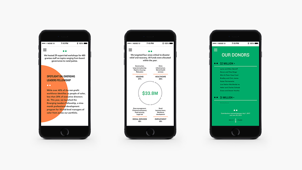
The second major piece was an annual report website. The site entitled “Moment of Truths” was the centerpiece of the campaign, and launched just before Tipping Point’s annual fundraising gala. The inspiration for the annual report was the idea that in the Bay Area we are facing two truths—how poverty in the Bay Area has steadily been getting worse, but also how Tipping Point and their donors have made a tangible, positive impact on thousands of people who are now on a path out of poverty. To speak to both realities, we designed a long-scroll site that allowed us to juxtapose the two truths as a split screen. The site is rich with animations and lots of custom icons, charts and graphs.
Website

