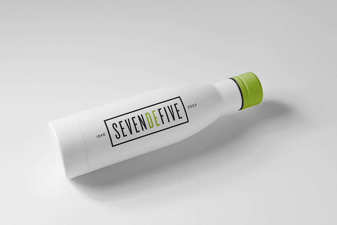
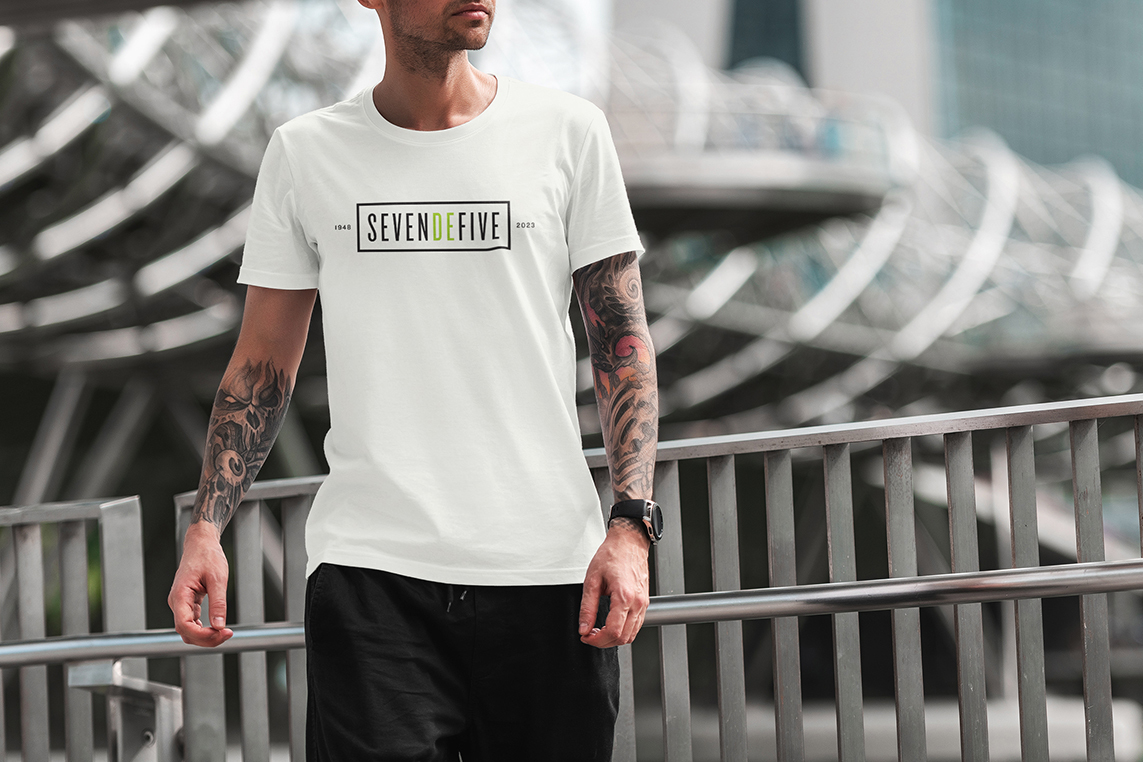
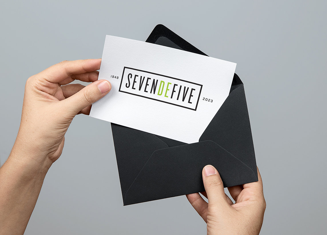
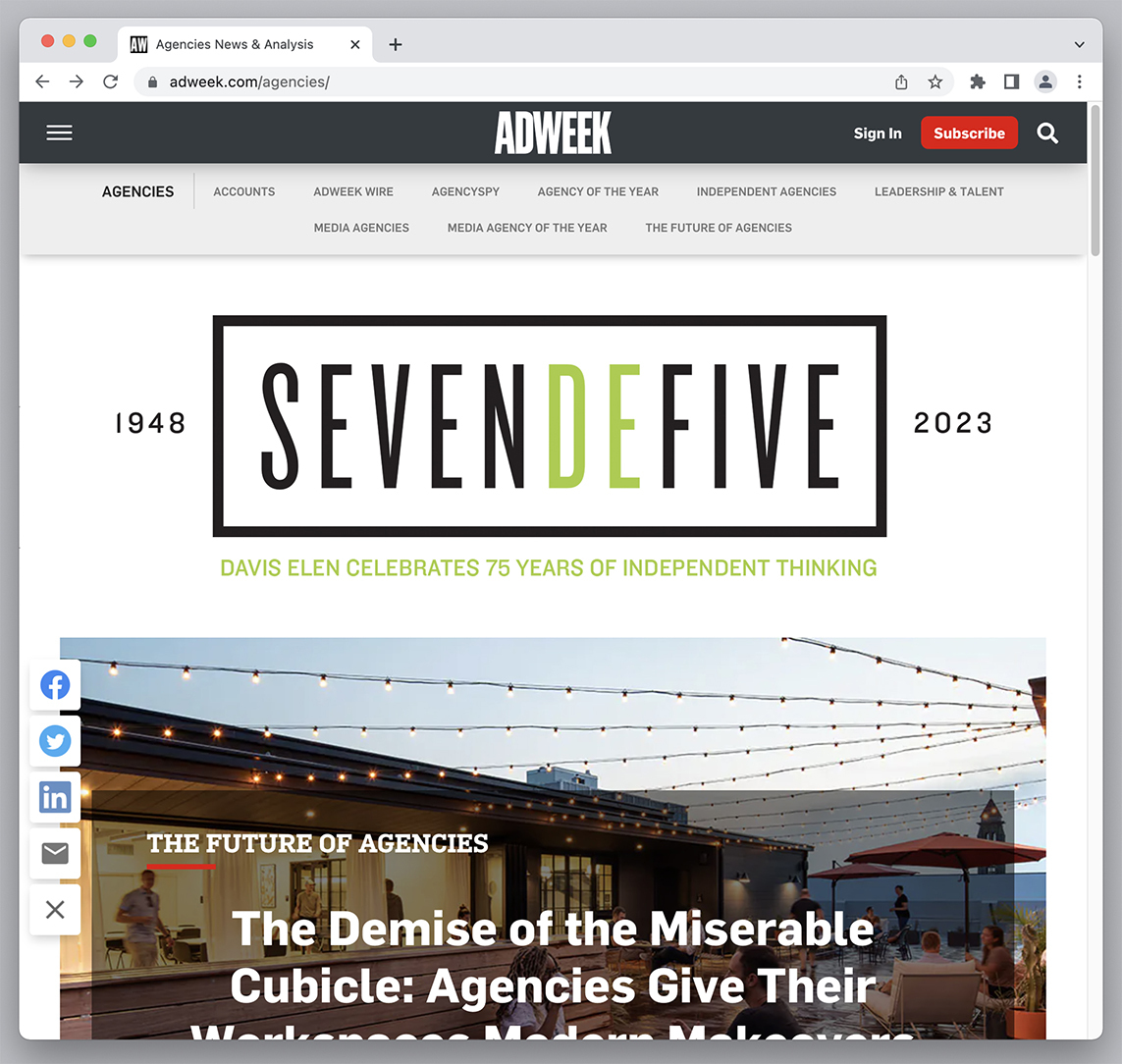
Davis Elen advertising is one of the oldest, independently-owned agencies in the country and 2023 marked their impressive 75th anniversary. Because this was such a significant milestone, DE planned an entire year of parties, events, thought-leadership pieces, press releases, swag giveaways, and lots of social posts. It was clear that with all of this planned hype, they were going to need a strong 75th anniversary logo to brand everything.
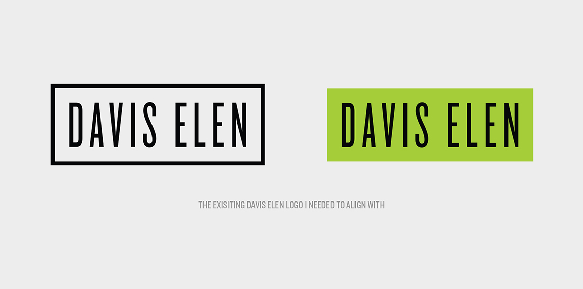
The entire agency was briefed on the project (non-creatives too) and my concept was ultimately chosen. There were just a few mandatories as a part of the brief. The logo needed to be flexible enough to scale like crazy, be printed on many different materials, lend itself to compelling animation, and visually tie tightly to the current Davis Elen logo which had just been redesigned.
As I was sitting in the briefing hearing people say the number seventy-five over and over, it struck me that nobody was really pronouncing the “t” in the number. It always sounded like a “d.” I wondered if I spelled the number out, could I replace the “ty” with “de” (Davis Elen’s initials and how most people refer to the agency) and still have people read and pronounce it properly? The answer was a resounding, yes, and so my anniversary wordmark was born.
Identity