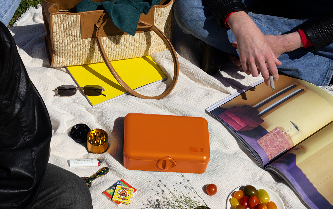
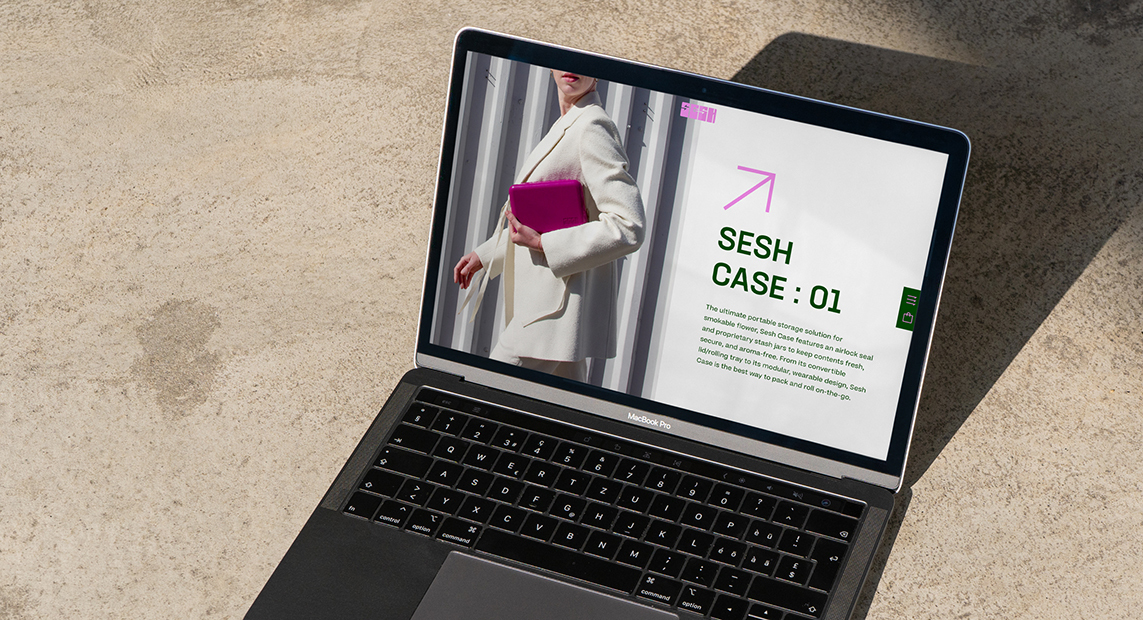
Plastic baggies, Tuperware containers, and prescription medicine bottles are what so many people use to store and transport their cannabis. The founders of Sesh wanted a much better solution that was tailored to a cannabis user's specific needs and that would be a heck of a lot more stylish than one of your mom’s Weck jars. Thus, the creation of their first product, Sesh Case. I like to refer to it as a travel humidor for your weed but that doesn’t really do it justice. The Sesh Case has all sorts of features like a smell-proof seal, locking mechanism, multiple storage jars, a scoop, and a lid that opens to double as a rolling tray. It is also lightweight and durable which make it perfect for on-the-go use.
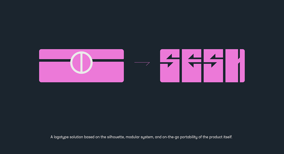
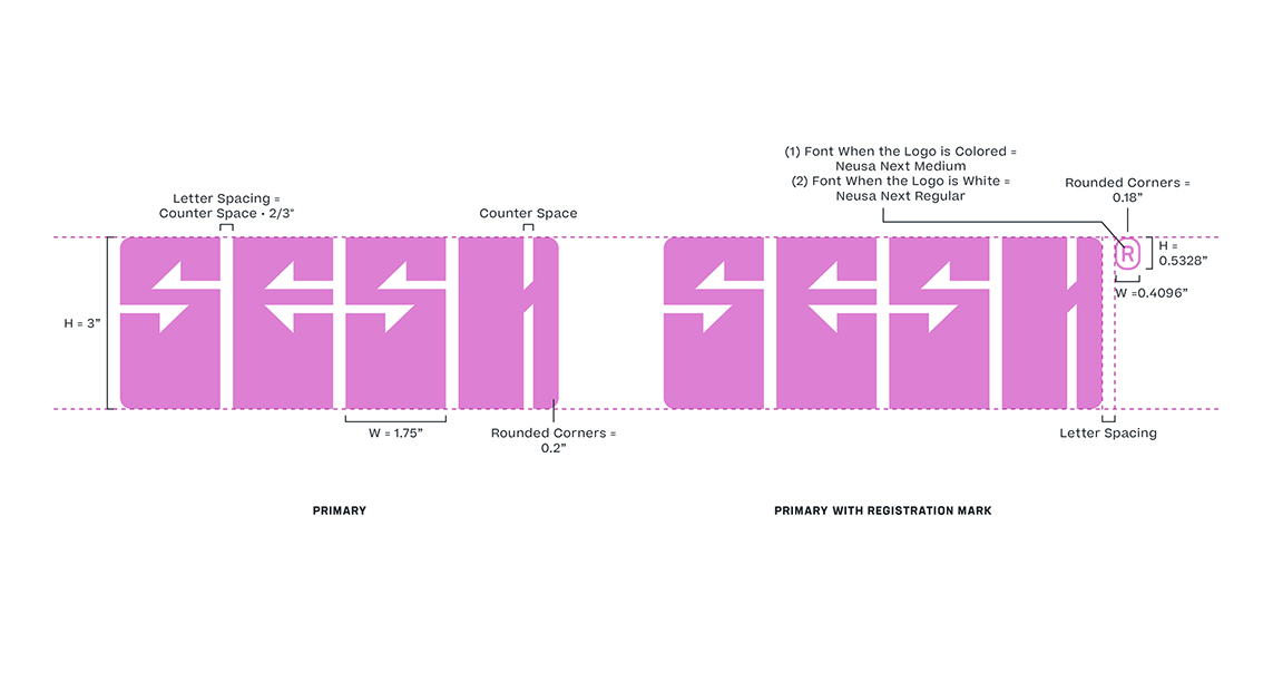
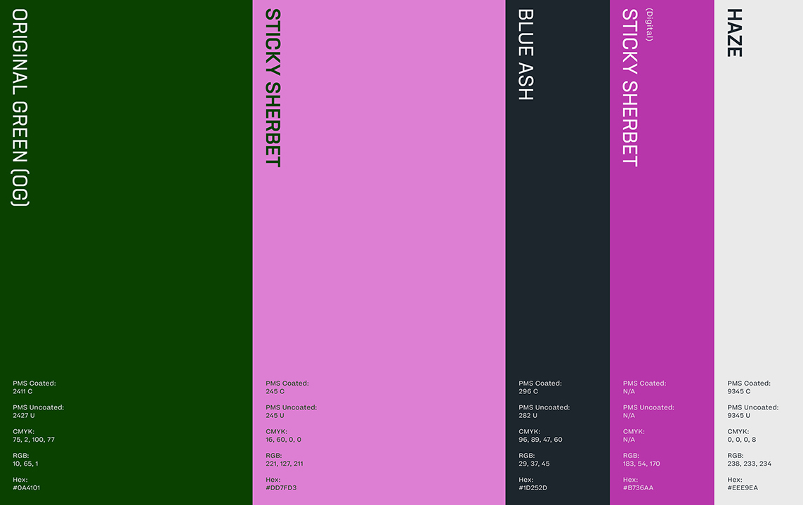
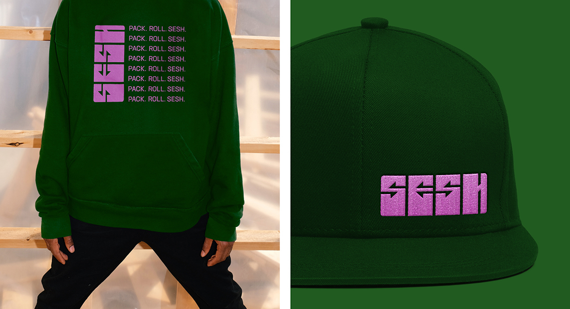
The case had already gone through rounds of prototyping when they approached us about creating a brand identity. While we knew there was still months of refinement ahead, the core design and functionality was in place. We used the case’s shape and its modular system of jars as inspiration for a custom logotype solution that utilized rearrangeable letter forms allowing for lots of flexibility within the system. We turned the letters’ counter space into funky arrows that were designed to convey the case’s on-the-go nature. Once we had the logo dialed in black and white we started exploring a wide range of colors pulled directly from a sticky bud. We landed on a pink that we called “sherbet” as the logo’s primary color and surrounded it with a few other tasty choices.
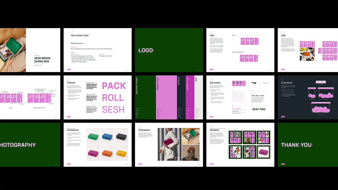
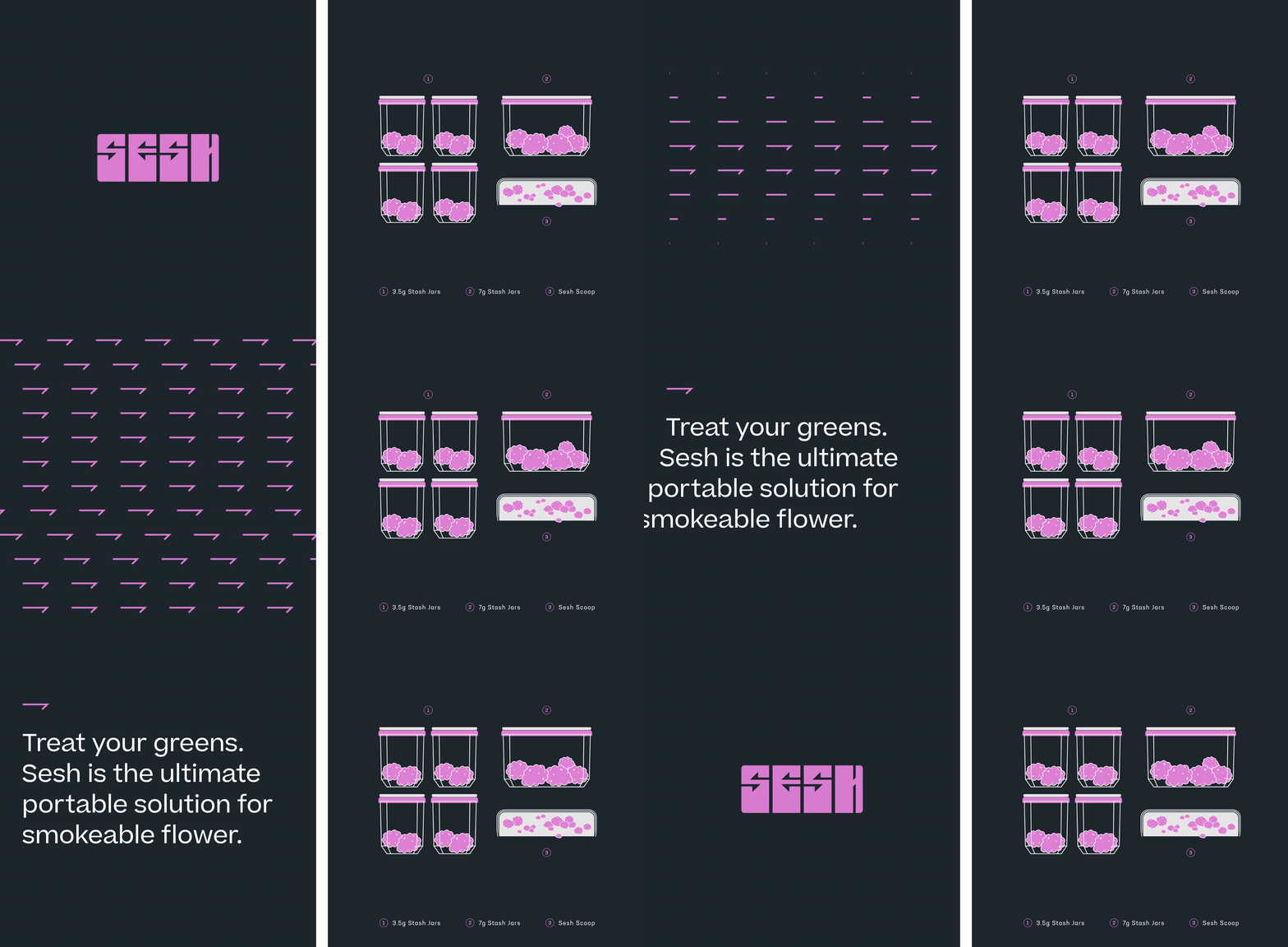
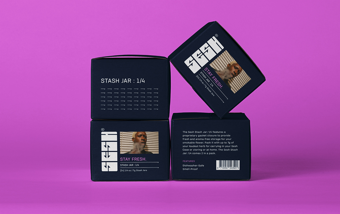
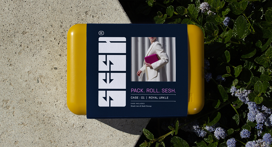
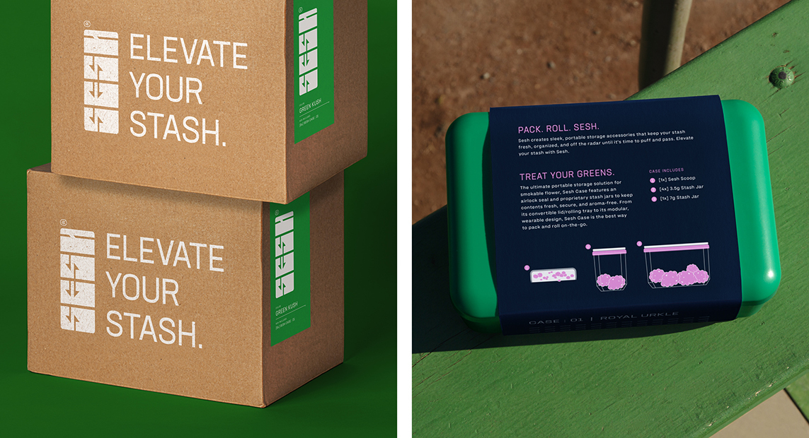
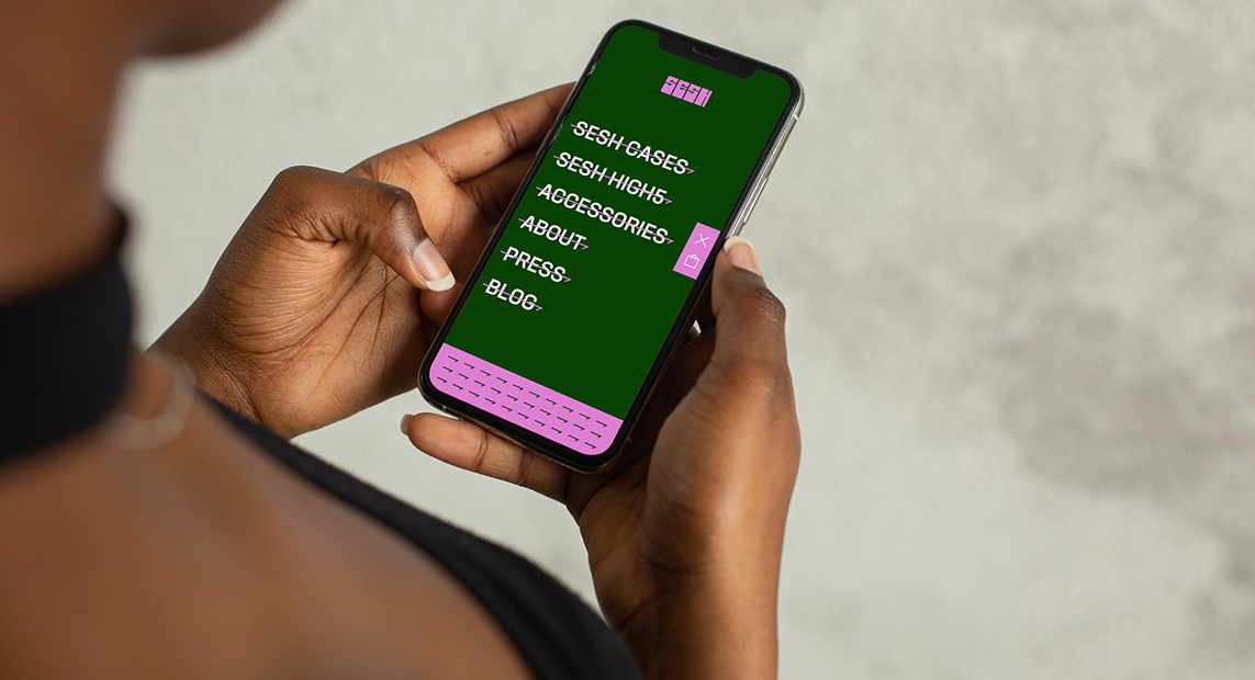
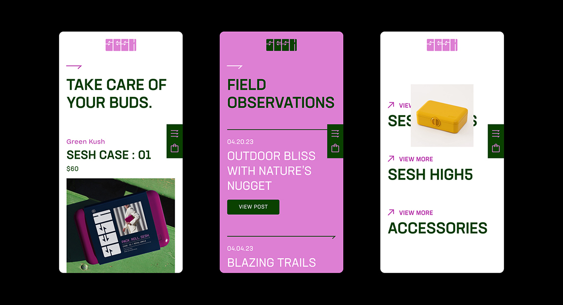
From there, we selected brand fonts, illustrated components of the case, decided on a look and feel for lifestyle and product photography, and worked on messaging. That gave us the core assets to develop our first major application which was packaging. There were three pieces to the packaging system that needed to be designed. We began with packaging for the case itself, then moved onto the jar packaging, and rounded it out with the shipper boxes. After packaging, we designed their website, a bunch of social templates, and some swag for their online store.
Even if you are just an occasional smoker, I highly recommend you step away from that mason jar and get yourself a Sesh Case.
Identity and Packaging


Website
Swag

Social