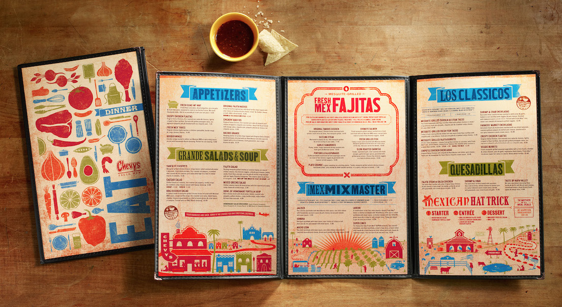
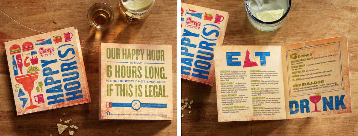
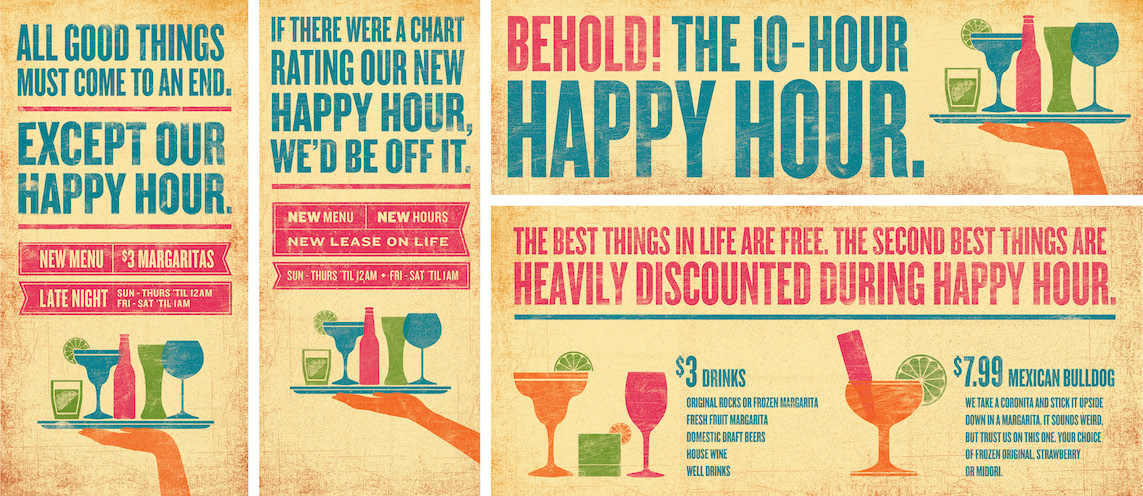
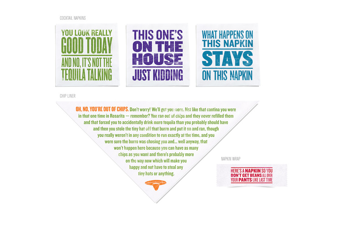
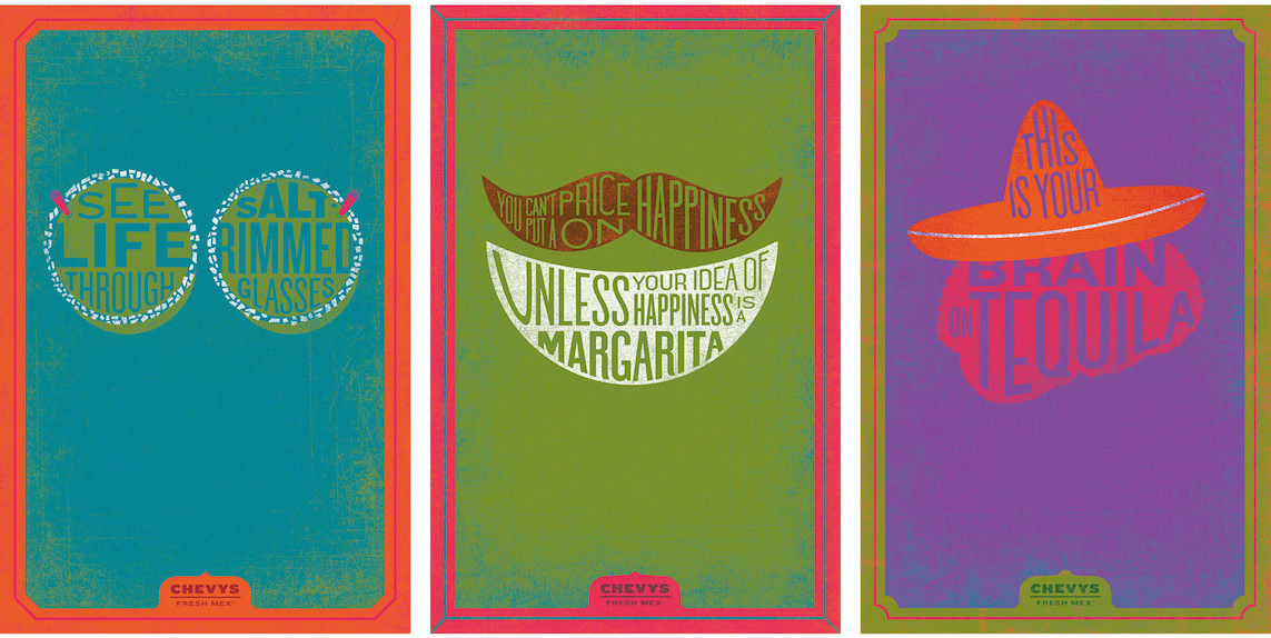
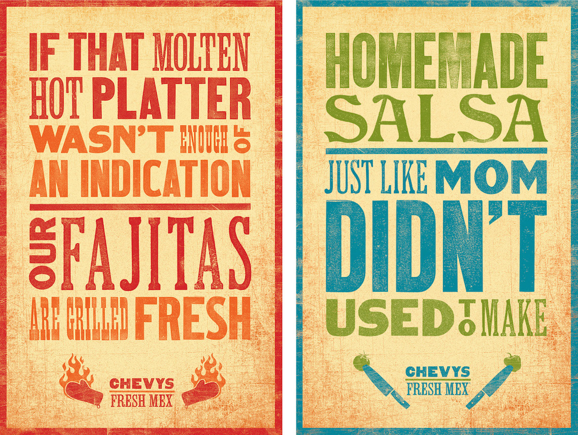
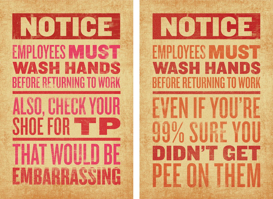
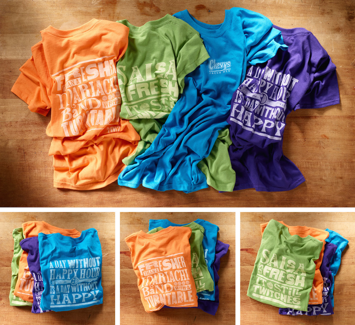
Back in the day people dug Chevys Fresh Mex restaurants. The spaces felt more like an irreverent border cantina than a Denny’s and their food, like their name states, tasted fresh. Along the way though they lost their direction and literally became the Mexican Denny’s. The result was them alienating many of their original, die-hard customers. Luckily, the newest folks in charge at Chevys realized something needed to be done and hired us to rebrand the entire chain in hopes of recapturing what they once stood for. While the kitchens worked on improving the food, we did just about everything else. Starting with new menus for the restaurant and the bar, to a new website, to posters throughout the spaces, to the napkins and napkins rings, to the shirts the servers wore. We even designed the chip basket liners. Love their chips!
Communication Arts was pickin’ up what we were puttin’ down. You can read more about the work HERE.
Collateral
