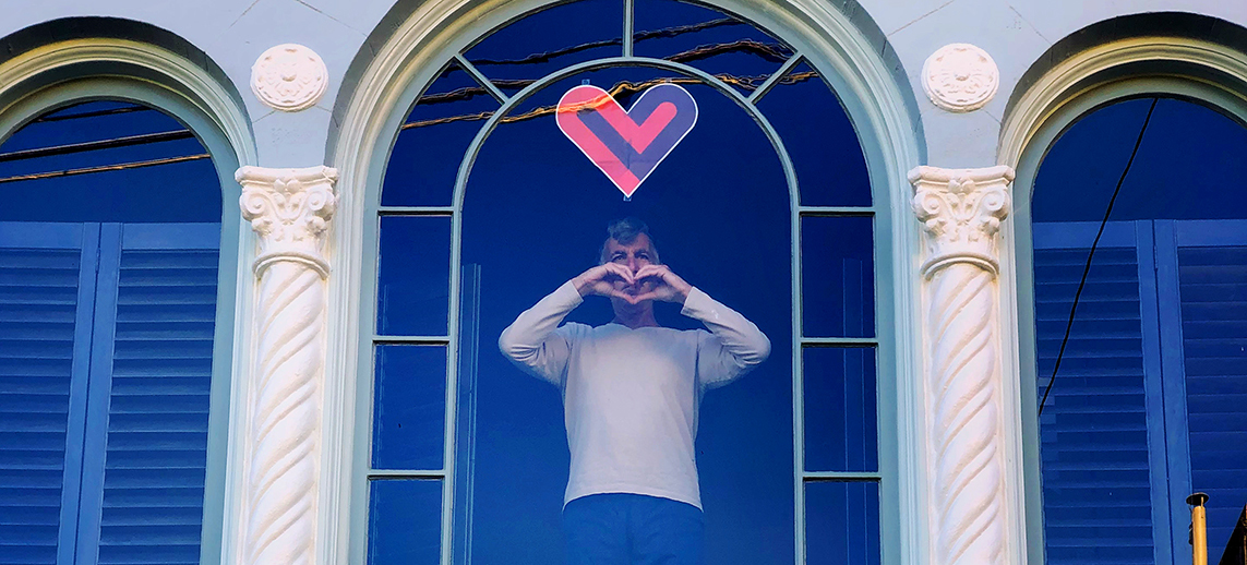
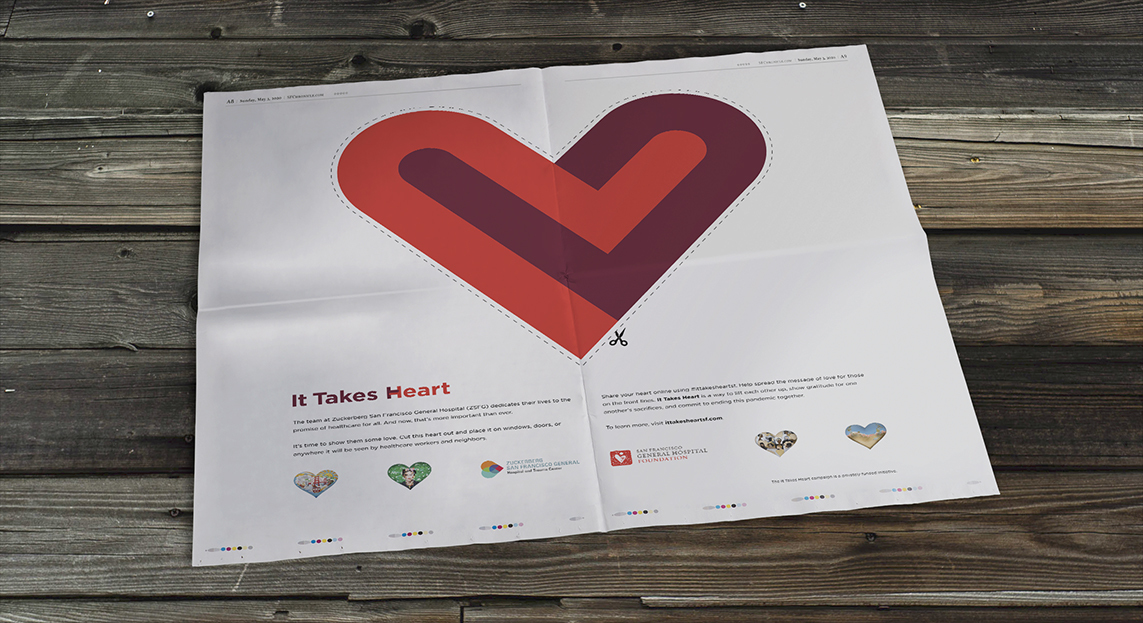
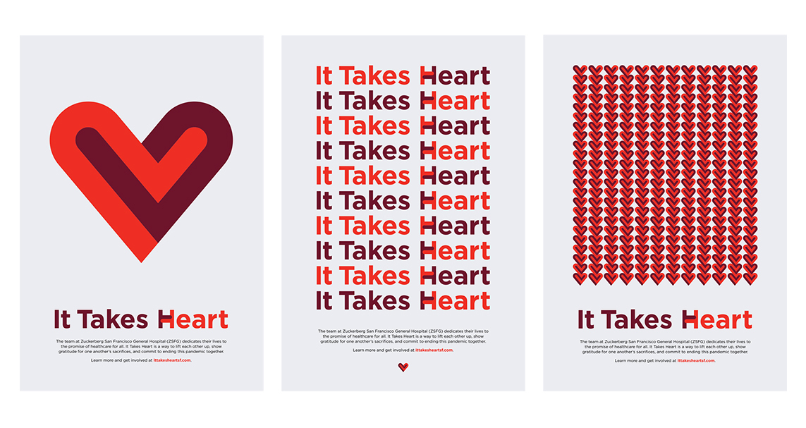
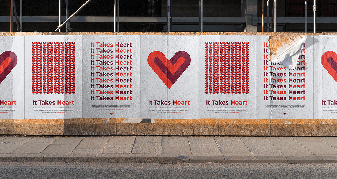
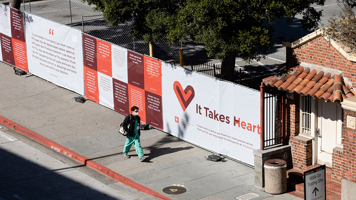
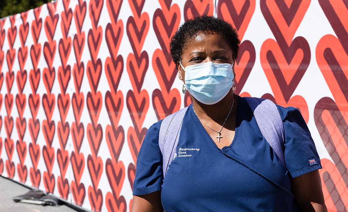
We had already done some brand strategy and identity work for the San Francisco General Hospital Foundation when they approached us during the pandemic about creating a city-wide campaign encouraging the community to show their gratitude for the frontline workers at ZSFGH. They wanted us to develop a name for the campaign that felt connected to their brand and, from there, build a strong identity that included an icon that could be used as a symbol of support. That icon would become the center of the campaign, showing up in newspaper ads, posters, flyers, websites, murals, and a huge installation outside of ZSFGH.
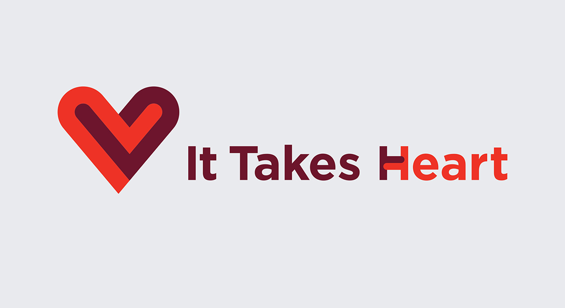
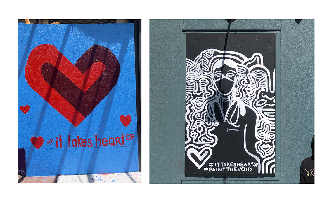
Since the foundations’s logo is a heart and they are responsible for the “Hearts in SF” sculpture program, we thought focusing around this word and symbol made a lot of sense. We landed on “It Takes Heart” which felt like a great nod not only to the frontline workers but to the San Francisco community that was doing so much to keep one another safe. From there, we designed a heart icon that was abstractly representing two people embracing. We also customized the wordmark to include an embracing letter “H.”
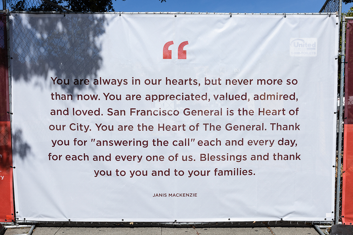
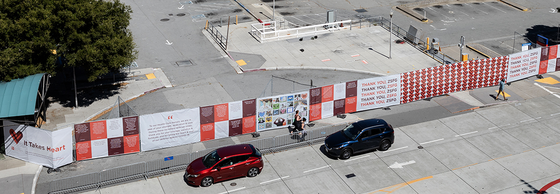
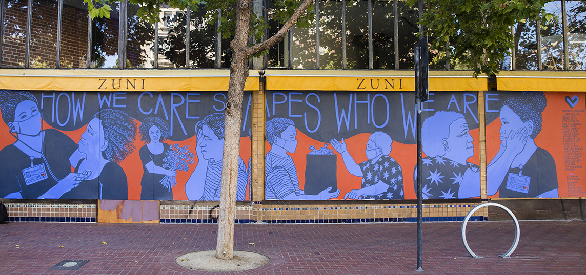
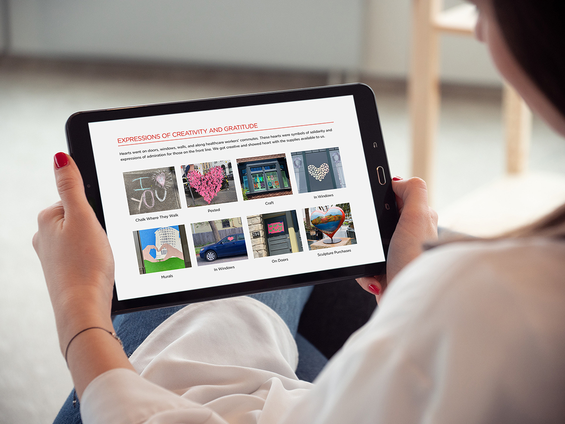
The rest of the system was quickly built and rolled out over the following weeks. It didn’t take long before our embracing heart icon started showing up in all sorts of fun ways around the city and in people’s social feeds via the ittakesheartsf hashtag. The community was also encouraged to send in letters of support and thanks to the frontline works via the website we helped design and build. Those started pouring in and would become the other core component of the 200-foot "thank you" wall in front of the hospital.
As we were all struggling to find ways of connecting during this challenging time, it felt very special being a part of this initiative.
Naming and Identity

Print and Outdoor
Murals
Website
Gratitude
