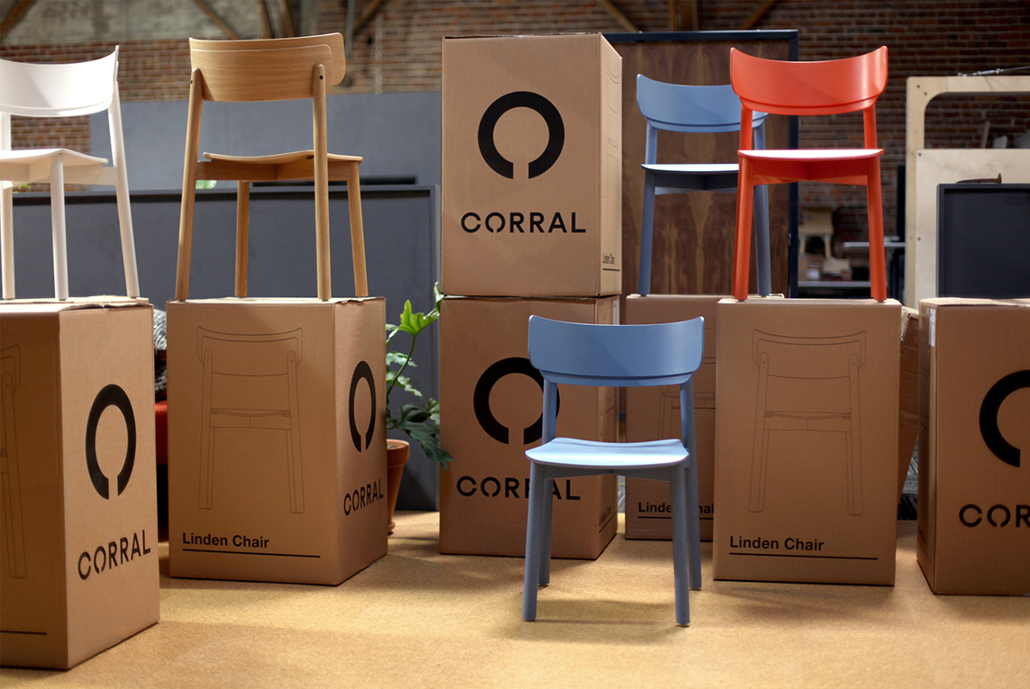
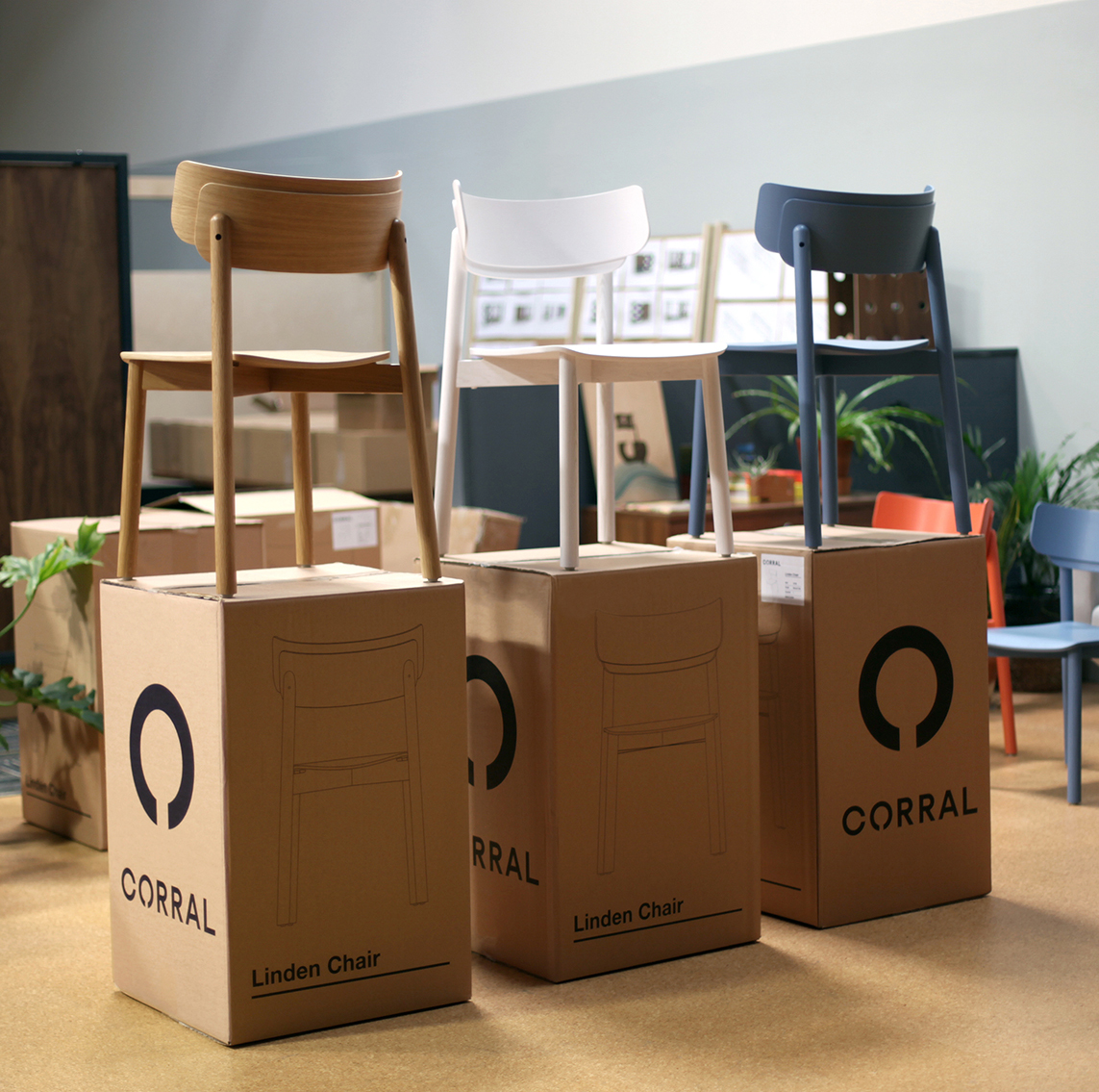
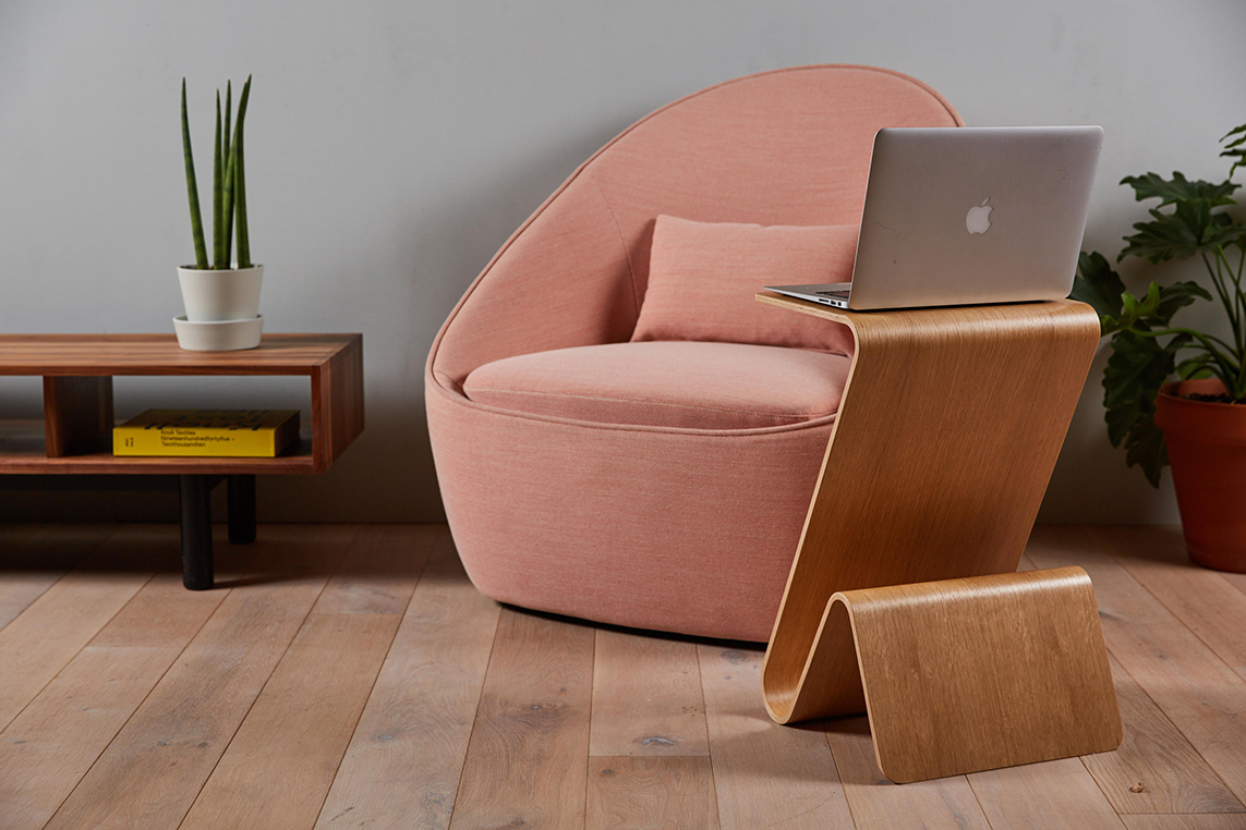
It’s not every day that one of your favorite furniture designers asks you to help name his new company and then create the identity for it but that is exactly what happened when Eric Pfeiffer gave me a ring about his latest venture. He was launching a new furniture company that aimed to explore and further define an American design ethos by creating products that blend utility and aesthetics to make purposeful everyday objects with an honest use of material. The company would be a collaboration between multiple designers, all of whom are American designers, working in this American design ethos.
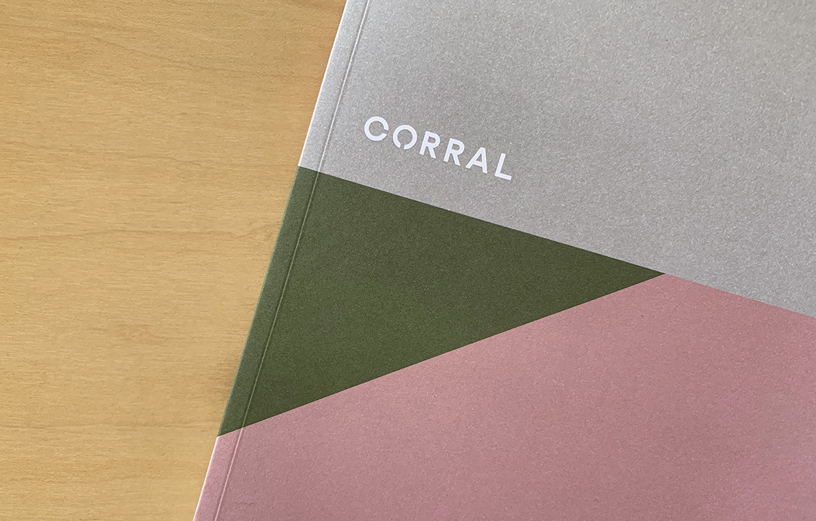
As I thought about the name, I wanted a couple of things to come through. It had to feel like an American name and it should express the idea of a group rather than an individual. I was aware of the many applications, including on the furniture and products themselves, so I wanted the name to be short. And, lastly, I wanted the name to be real and honest like the product, not some made up crap like so many new companies use. The name “Corral” seemed to fit the bill. Eric agreed.
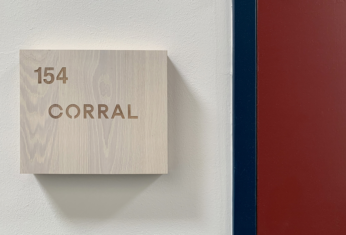
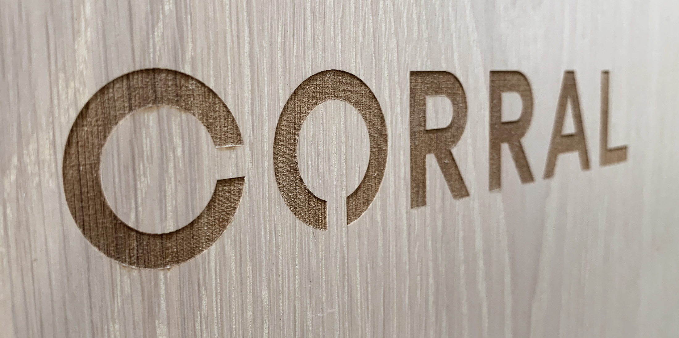
When it came to the logo, Eric made it clear that he wanted a simple type solution but with some sort element that could be pulled out and used as a mark. In thinking about the images that the word “corral” starts to conjure, it seemed like the “o” was the place to make this happen.
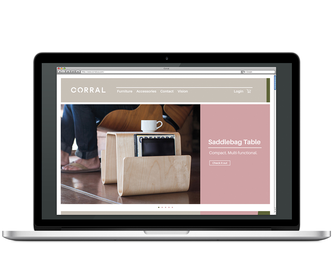
You can check out some more of the brand and all of the excellent products at corralusa.com.
Identity