This client came to us knowing exactly whom they wanted to target and how. A street-inspired aesthetic for the just-legal audience.
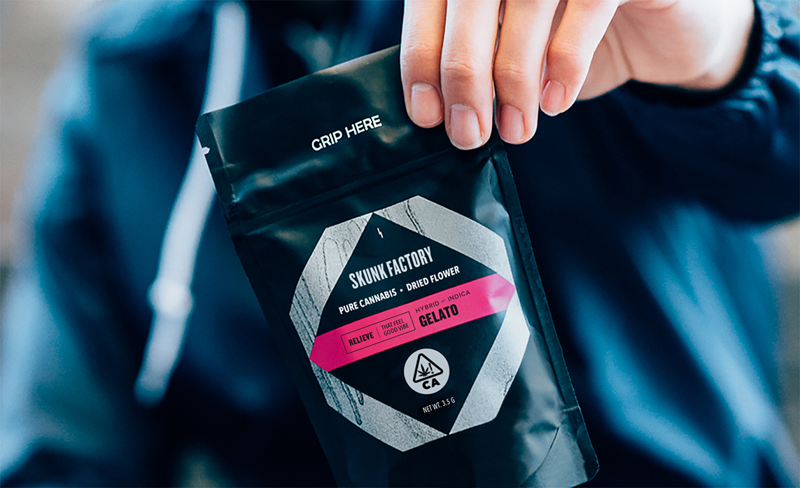
The vape packaging had already been established when I joined the team. Our next challenge was flower packaging. We would have far less control over the actual structure but still needed to find an affordable design solution that fit well with the vape boxes and overall brand look.
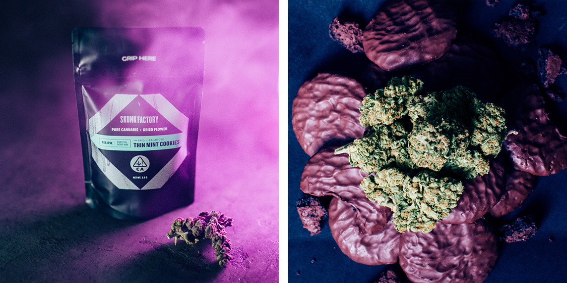
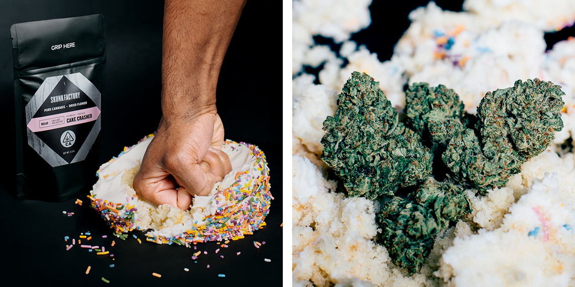
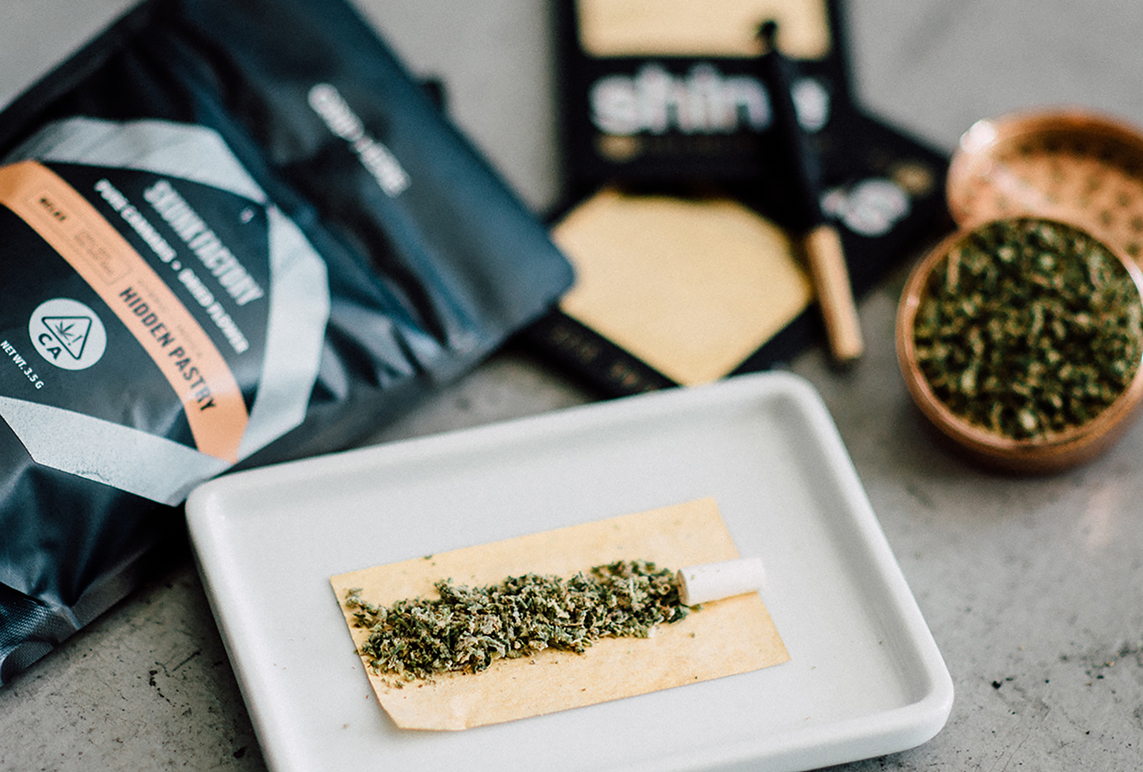
We ended up with an all black, zipper-seal pouch and a die cut sticker that leveraged the key assets from the existing packaging but presented them in a unique way. Both the use of the spray paint texture and the colored tape that indicates different flavors were presented in a new way here. Even the back labels, that would need to be printed in-house on a basic laser printer, were given extra attention as to not feel like an afterthought.
The Skunk Factory packaging has been celebrated and referenced over and over in the cannabis community as a great example of designing for a specific audience in the ever-growing and evolving space.
Packaging