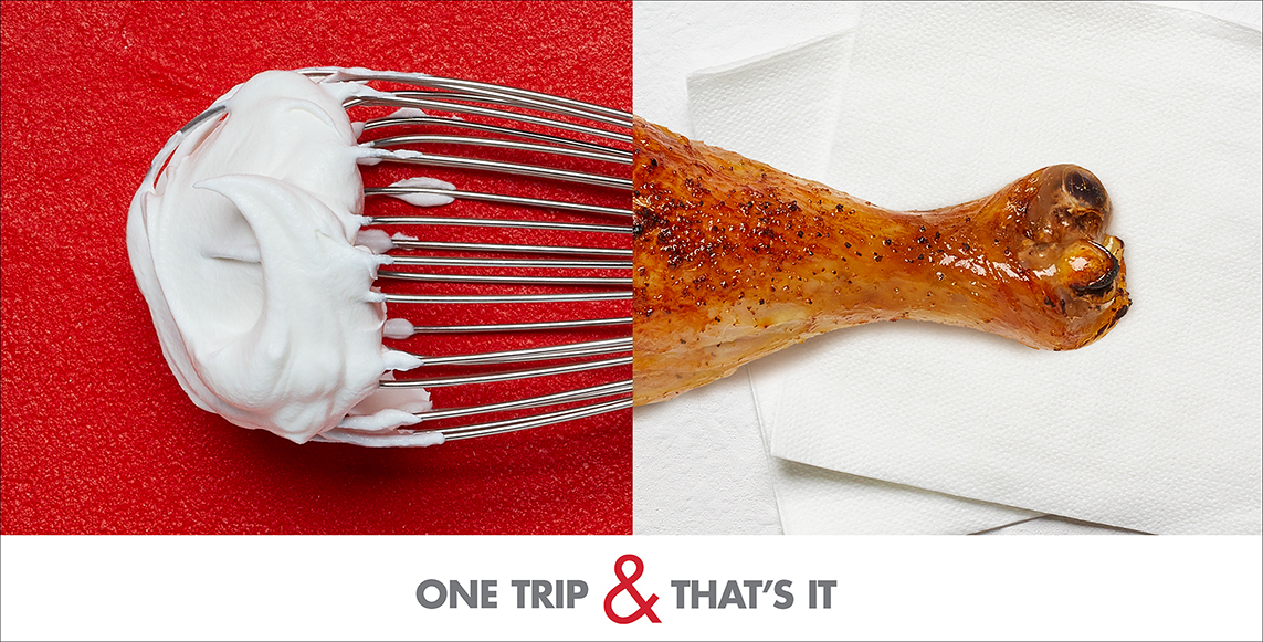
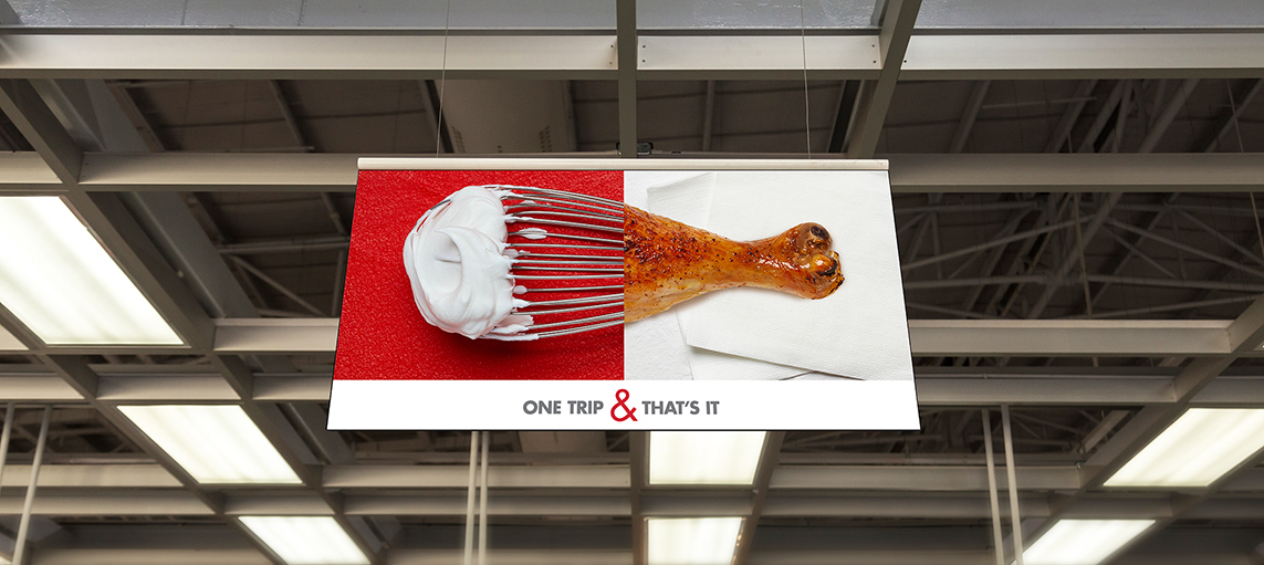
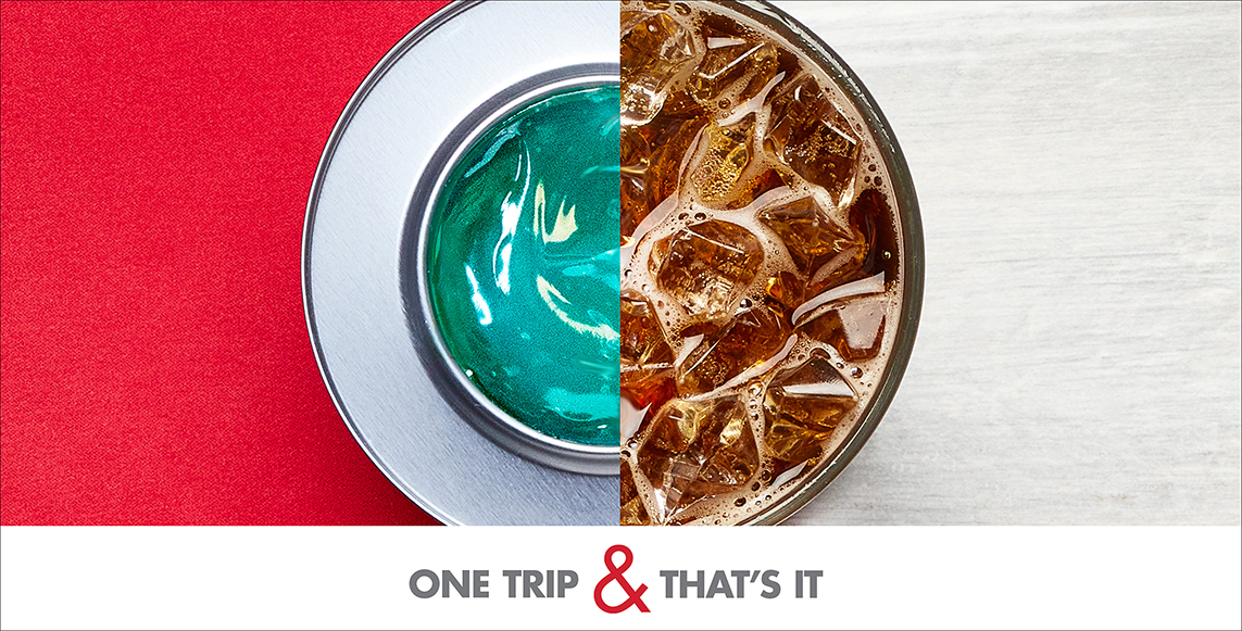
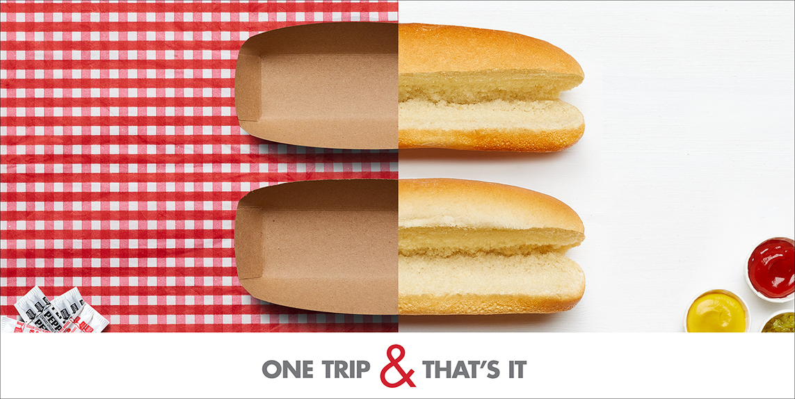
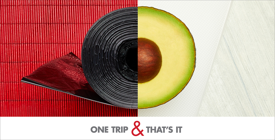
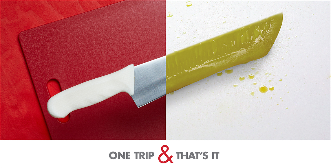
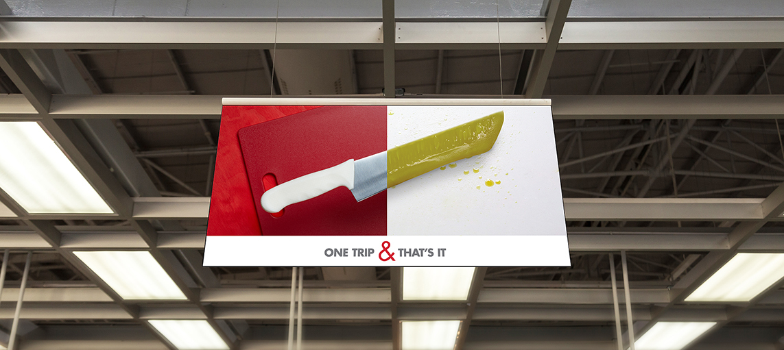
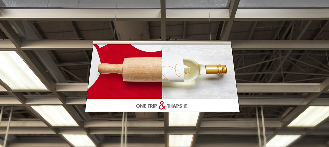
Smart & Final approached us to refresh all of the hanging banners that filled the aisles of their many grocery stores across the West. These banners would potentially be in the spaces for a couple of years and, up until that point, had been primarily headline-driven.
We decided it was time for a visual approach. After all, these banners were a significant part of the overall visual design of the interiors. If we created something that looked more like art than advertising, it would add to the longevity of the pieces, therefore addressing a key client concern around messaging burnout on the existing banners.
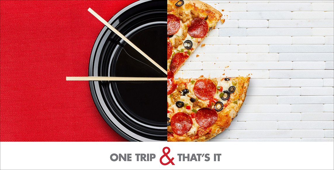
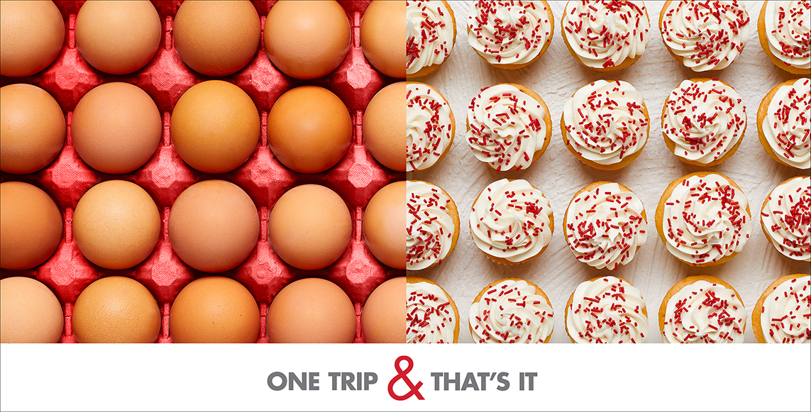
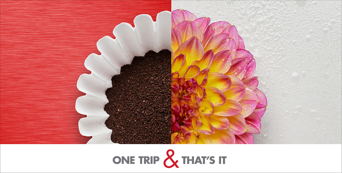
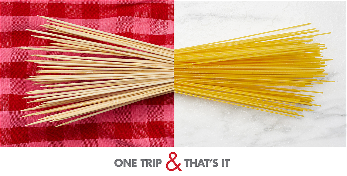
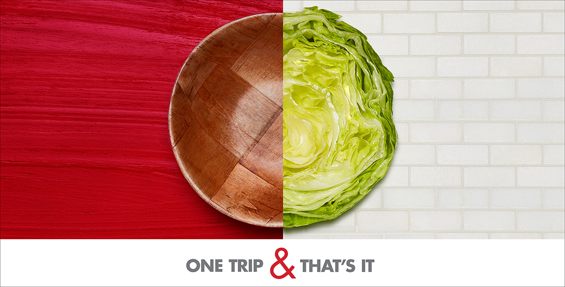
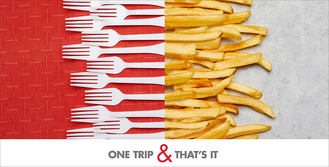
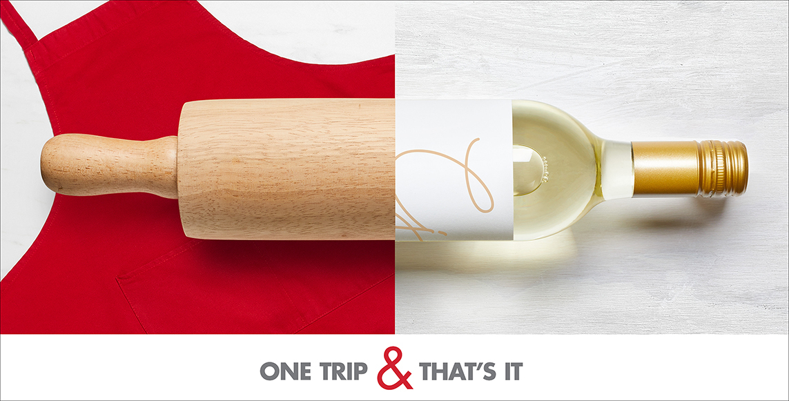
Smart & Final’s core differentiator is that they sell everything a person grocery shopping for their business would need, as well as what a person shopping for their household would need - all without the membership fees their competitors imposed. This is summarized in their tagline, “One Trip & That’s It.” We challenged ourselves to express these two sides of the economy through compelling images. We started with a top 100 list of the best selling items for businesses and the best selling items for households. We first selected items from the business side of things and began trying to match them up with items from the household side. If a pairing worked in a surprisingly seamless way or brought a big smile to our faces, we knew we had a winner.
We had an initial set of 25 pairings that were slowly weeded down as we locked more into the specific art direction for the photographs. We were stubborn about trying to get as much as possible to work practically rather than leaning on Photoshop. So, things like sizing, shape, and even texture became deciding factors in getting us to the final grouping.
The banner executions were so well-received that they ended up being repurposed as billboards, printed collateral, and numerous animated social posts.
In-Store
