H2O+ approached us to help them design and launch a new line of sensitive skin care and body products. They challenged us with creating packaging that signaled a shift in the company’s commitment to developing cleaner products. They also wanted a solution that diverged from their current design system.
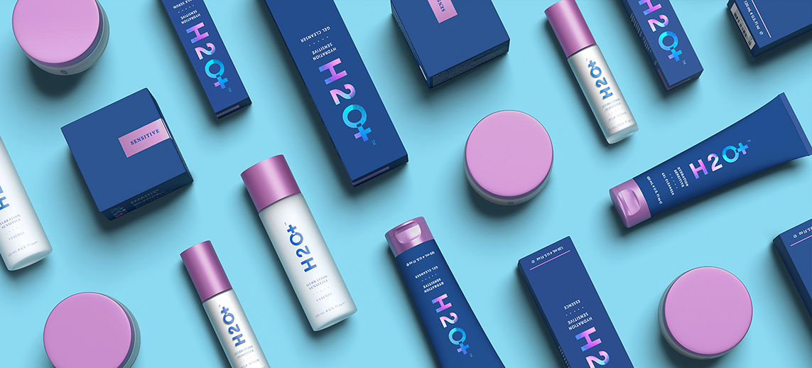
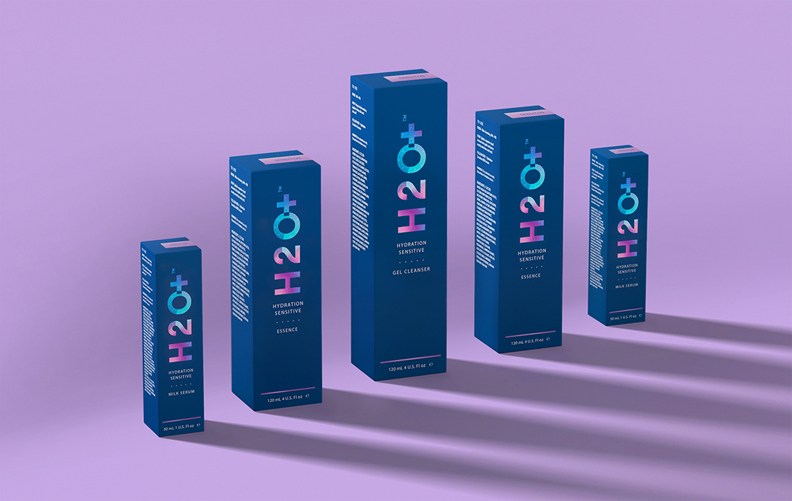
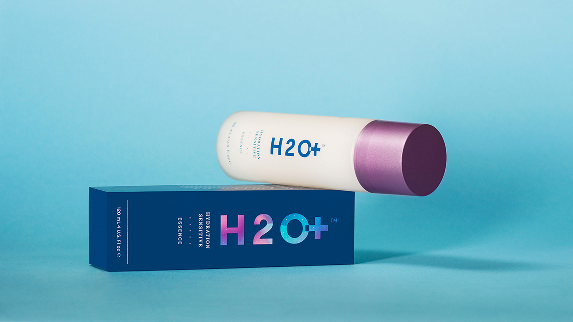
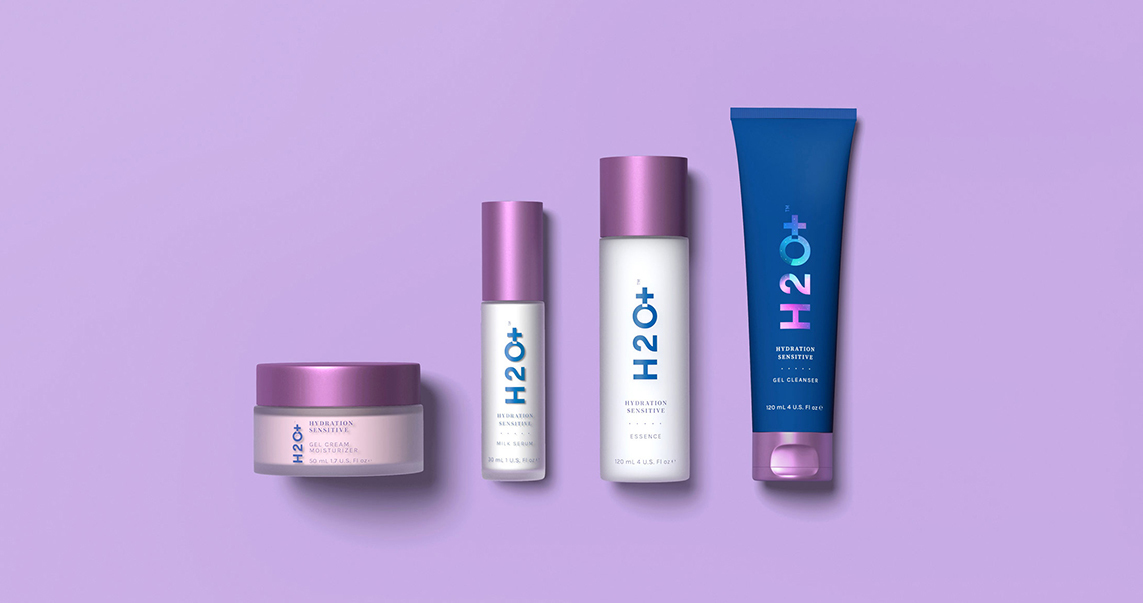
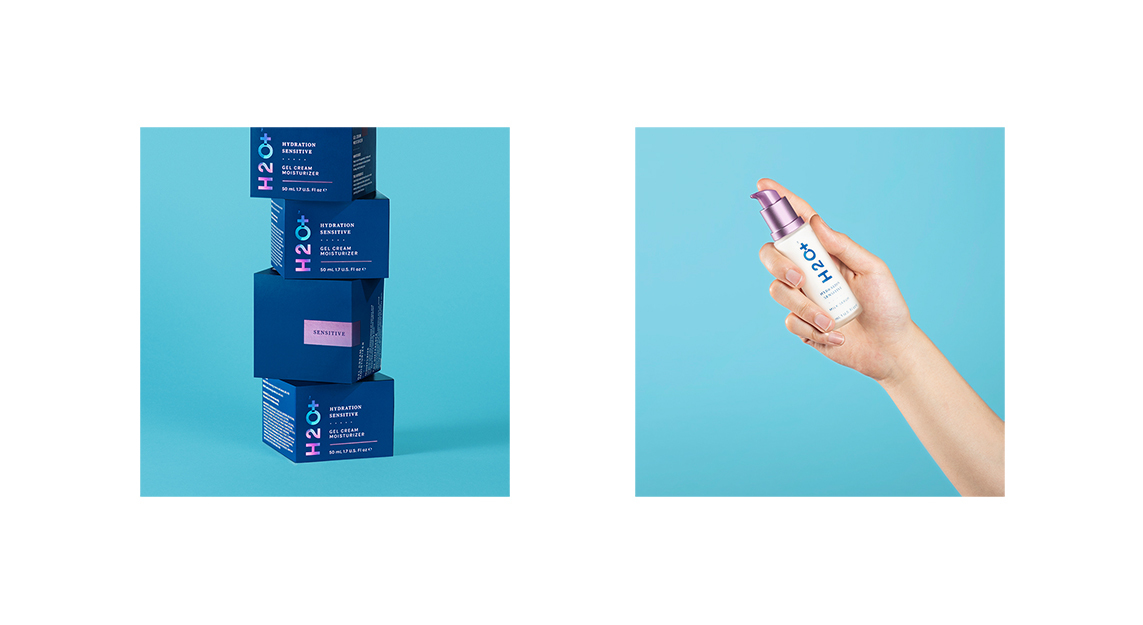
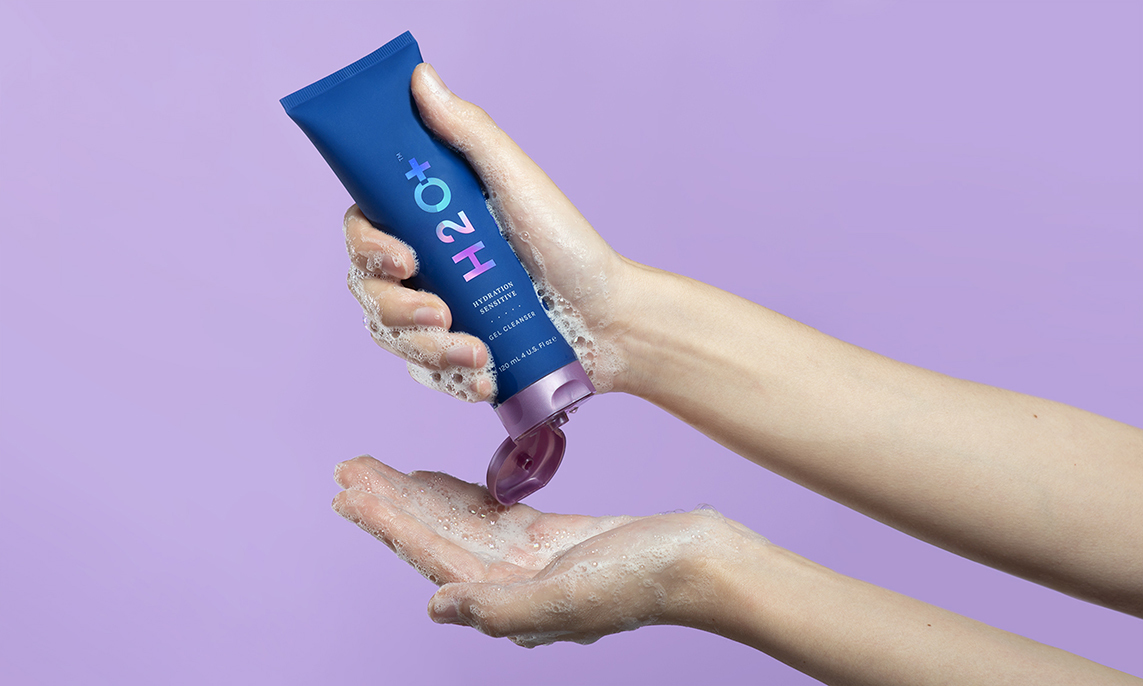
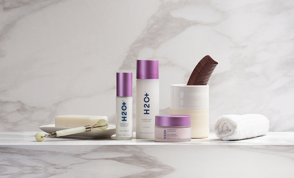
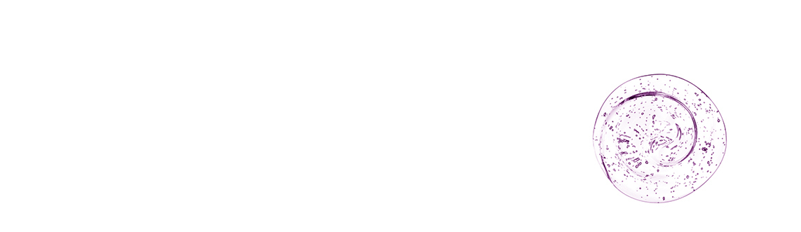
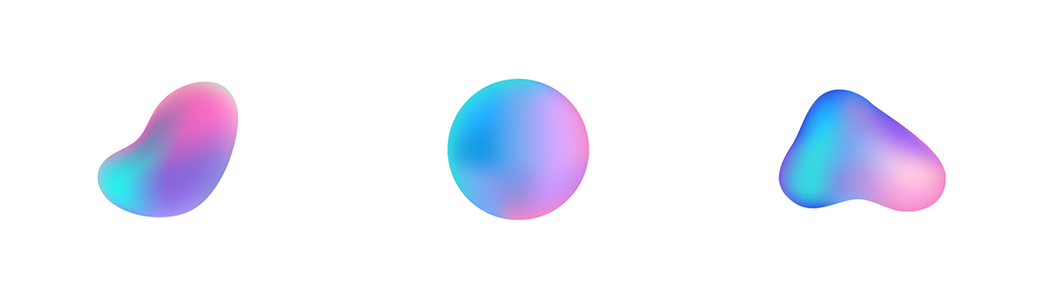
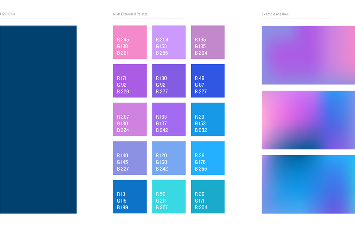
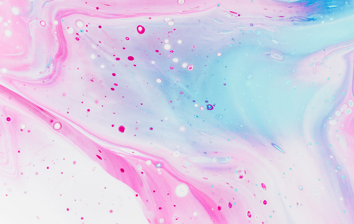
Most brands in this particular skincare category lean on minimal, black and white packaging. It looks crisp and expensive but it all looks the same. To stand out from the competition and evoke their products’ ability to deliver deep hydration, we explored the levels of the ocean where light barely penetrates. The rich, almost black, midnight blue we found there became a base for the brighter colors of the extended palette. Tides, currents, bubbles, and other physical characteristics of water inspired the dots, waves, and gradient meshes, giving the graphics a vibrant sense of movement. All of this was combined into a new iteration of H2O+’s logo (minus “Beauty”, which we felt was unnecessary).
Our new design system was rolled out to five products with many more planned. It pops off shelves like crazy and has received an overwhelmingly positive response from their customers, including lots of social chatter about how tasty the packaging is. Heart emojis galore.
Identity

Packaging